
Granada Theatre App
Redesigning Granada Theatre’s app experience
Project Overview
I redesigned the Granada Theatre mobile app to focus on greater consistency in navigation, intuitive information architecture and increased visibility for their performances and events. My design process was guided by Nielson’s heuristics, user interviews, and moderated usability tests.
Skills: Research, information architecture, wireframing, prototyping, visual design and creative direction
Timeline: 72 hours
Tools: Pen & paper, Sketch, Framer X
Introduction
I recently moved to Santa Barbara, and was struck by the sheer volume of theatres in this beautiful city! As a lover of the arts, I was drawn to the many options. I was particularly interested in Granada Theatre, a historic landmark which has existed for over a century. Interested to buy a ticket for a show, I downloaded the Granada Theatre app.
As I navigated through the app, I noticed several opportunities for improvement. Careful to put my biases aside, I embarked on a 72 hour challenge to redesign the Granada Theatre app.
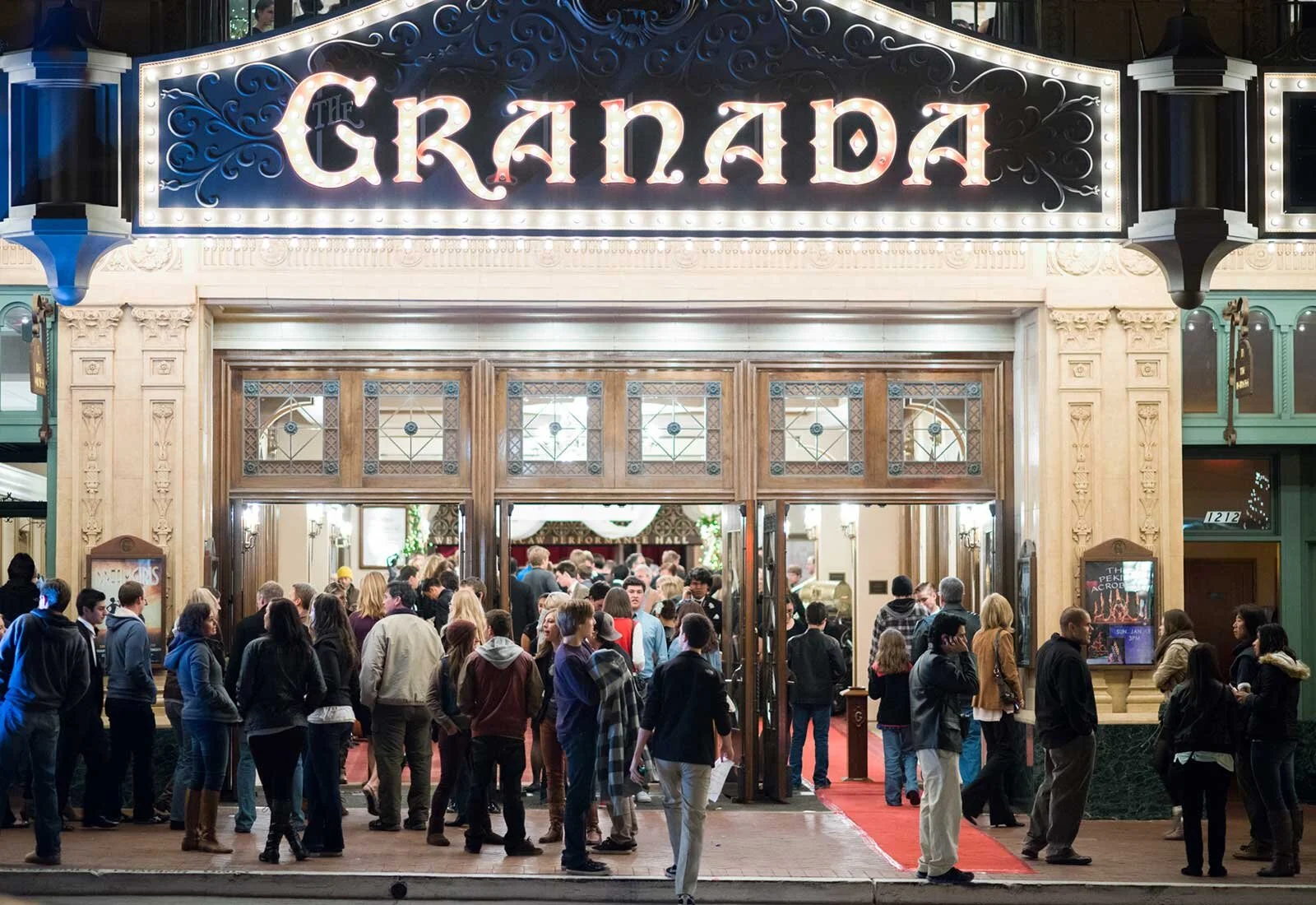
Granada Theatre, a Santa Barbara performing arts venue, is a historic landmark which has existed for over a century.
Research
Nielson’s Heuristics
I zeroed in on Nielson’s 4th Heuristic “consistency and standards,” as I evaluated the Granada Theatre app
There was an apparent inconsistency in the navigation of the Granada Theatre app.
Upon opening the app, the user sees a table of icons. This appears to be a homescreen, (although that is not stated anywhere at this level of navigation). Tapping the ‘events’ ‘account’ or ‘photos’ icon, a tab bar appears. However, tapping any of the other icons results in no presence of a tab bar. Instead, a ‘back’ button appears.
Along this same line, there is no consistency for wayfinding within the app experience. For instance, when on the ‘events’ page, the tab bar provides appropriate feedback with an active state icon. In contrast, when on the ‘Granada News’ page, there is no written or visual location indicator. In short, there is poor and inconsistent feedback when it comes to communicating the system’s current state
These inconsistencies can be further evaluated using Nielson’s recent article outlining the “Top 10 Application Design Mistakes.”
Poor Feedback
There are a lack of consistent location indicators in the app experience. Using the feedback of an active state icon in the tab only some of the time risks causing confusion and disorientation.
Inconsistency
Using a tab bar in certain instances, and a back button in others is inconsistent. Different commands for the same action cause unnecessary cognitive overload. The tab bar being available sometimes and not being discoverable other times for no apparent reason runs the risk of causing frustration.
An apparent inconsistency. From the homepage to ‘events’ page, the mode of navigation is a tab bar. From the homepage to the ‘Granada news’ page, the mode of navigation is a back button.
User Interviews
I conducted three user interviews. Their aim was to understand users expectations, wants and needs from Granada Theatre app.
Screener Criteria:
Participants have attended at least 2 events at Granada Theatre
Participants must own a smartphone
Results:
My interviews with these three participants uncovered some interesting findings.
When asked “how do you find out about events at Granada Theatre?” all participants answered similarly. These participants found out about events passively. Events were discovered through posters/flyers, word of mouth, the radio, or walking by the theatre itself.
Only ⅓ of the participants were aware of the Granada Theatre’s offerings besides shows, such as workshops, galas, and opportunities to rent the venue for public or private events
When asked about ticket buying habits, ⅔ participants recounted how they had forgotten to buy tickets for a show in the recent past.
Moderated Usability Tests:
I conducted three moderated usability tests with the Granada Theatre app

Before I began any Granada Theatre app specific testing, I asked participants to share information about their background, personal interests, and any apps they commonly use. I was interested in learning about the apps the participants typically use so I could better understand their mental models. This would give me insight into expectations they might have about app functionality.
To further my interest in understanding participant mental models, before I had the participants download the app, I asked them what they would expect to find in the app.
Next, I asked users to ‘think-aloud’ as they downloaded the app and navigated through it. I wanted to gain insights into how the current information architecture of the app influenced the participant’s impressions of it. Because my goal was to uncover higher level gaps in the navigational organization of the app, observing participant’s onboarding provided valuable insights.
Summary of Findings
Mental Models: Among the apps that participants used most often were Twitter, Instagram, Facebook, Venmo, Apple Podcasts, Maps, Uber and Lyft. These informed possible mental models.
Expectations: When asked what participants would expect to find in a theatre app, 100% said ticket purchasing and calendar of shows, 67% said address/contact information, 67% said videos of past performances, and 67% said promotions.
Positive feedback: 67% of participants found the events page to be intuitive. They didn’t have a hard time exploring the various events or purchasing tickets. “The most important thing is there and well executed, the events page,” said one participant.
“The most important thing is there, and it is well executed—the events page.”
Pain Points:
Onboarding: 100% of participants had poor overall impressions of the app upon onboarding. One participant stated “this app looks old school. It looks generic, it doesn’t look like a theatre app.” The other stated, “Based on how this app looks amateur, I would expect it to have a poor purchasing experience,” the third simply stated, “it’s just ugly.”
“This app looks old school. It looks generic. It doesn’t look like a theatre app.”
Navigation: One participant had difficulty understanding the need for the ‘more’ button at the tab bar. They explained that the organization of the app didn’t “make sense to them”. “What is hiding behind this ‘more’ button? I don’t see the need for this ‘Granada news,’ or ‘Profiles,’ it would make more sense to reorganize the app so there isn’t a ‘more’ page,” they said.
Another participant expressed confusion with the need for ‘Granada News.’ They said, “this piece of news is from 2015. The images on the news button are broken. The way they should use this page is to promote shows and events. It doesn’t make sense to use a news channel when their promotions should be around events.”
“They have a wonderful story to tell, but are not telling it the right way.”
The third participant had feedback about the homepage. They said, “They have a wonderful story to tell, but are not telling it the right way. “They don’t need a homepage, if this thing was better designed it wouldn’t be there.”
Navigating from the homepage to ‘Granada News.’ Images and buttons appear to be broken, and news items are outdated.
Bringing it all together
A journey map helped me to create a comprehensive story arc that represented my research findings.
Defining the Problem
The number of participants I had for both the interviews and usability tests were admittedly low, but I still found their insights to be salient.
With all of that research in mind, I created a defined the problem.
Problem defined:
Users do not have a consistent way of staying in touch with happenings at Granada Theatre. The Granada Theatre app is not filling this gap. Users expressed frustration with onboarding and outdated content. In addition, heuristic evaluation of the app resulted in apparent navigational inconsistencies.
Ideation
Informed by my research findings, I keyed in on three areas of focus for my redesign
Greater consistency in navigation
Prioritizing app organization based on hierarchy of needs
Increasing visibility for Granada Theatre’s shows and events
My solution statement helped me to further simplify this undertaking
How might I design an app that is enjoyable to use, and encourages people to have greater engagement with Granada Theatre?
Site Map
Based on my research, I created the information architecture for the app. Below I highlight the four pages featured on the tab bar.
Featured: Drawing from research participant’s mental models, I was inspired to design this to be a feed of upcoming events, news, or video of popular shows. This will encourage users to stay engaged with Granada Theatre. I designed ‘events,’ ‘media,’ and ‘news’ card types as building blocks for the featured page.
Connect: The connect page is meant help users stay involved with the Granada Theatre community. Research showed that participants expected to find contact and location information, and were also not aware of Granada Theatre’s offerings besides performances. The three subpages ‘plan a visit,’ ‘about us’ and ‘get involved’ would address these user needs. I also wanted to include a ‘donate’ section. Although I did not get a chance to talk with anyone at Granada Theatre, I felt safe in my assumption that donations were helpful to their organization.
“Research showed that participants were not aware of Granada Theatre’s offerings besides performances.”
Watch: Research showed that users expected to be able to see past performances on the Granada Theatre app. Granada Theatre currently has many recordings of their performances on Youtube, but they are not discoverable on their app. Furthermore, making this content accessible could increase app engagement and retention.
Shows: This page is dedicated to the aspect of the app that all my research participants agreed was vital—upcoming shows, a calendar of all shows, and ticketing. I chose not to focus on this page for the design challenge because users found the current design to be intuitive.
Wireframes
I designed these wireframes with consistency at top of mind. A tab bar was designed for the global navigation, so the user never feels disoriented. The featured page was designed using the building blocks of 3 card types:
Events: Upcoming shows, workshops, etc.
Media: Performances on demand
News: Blog posts, news, announcements, etc.
I designed the featured page to replace a static home screen. By having a dynamic, changing feed, the user is encouraged to stay engaged with Granada Theatre.
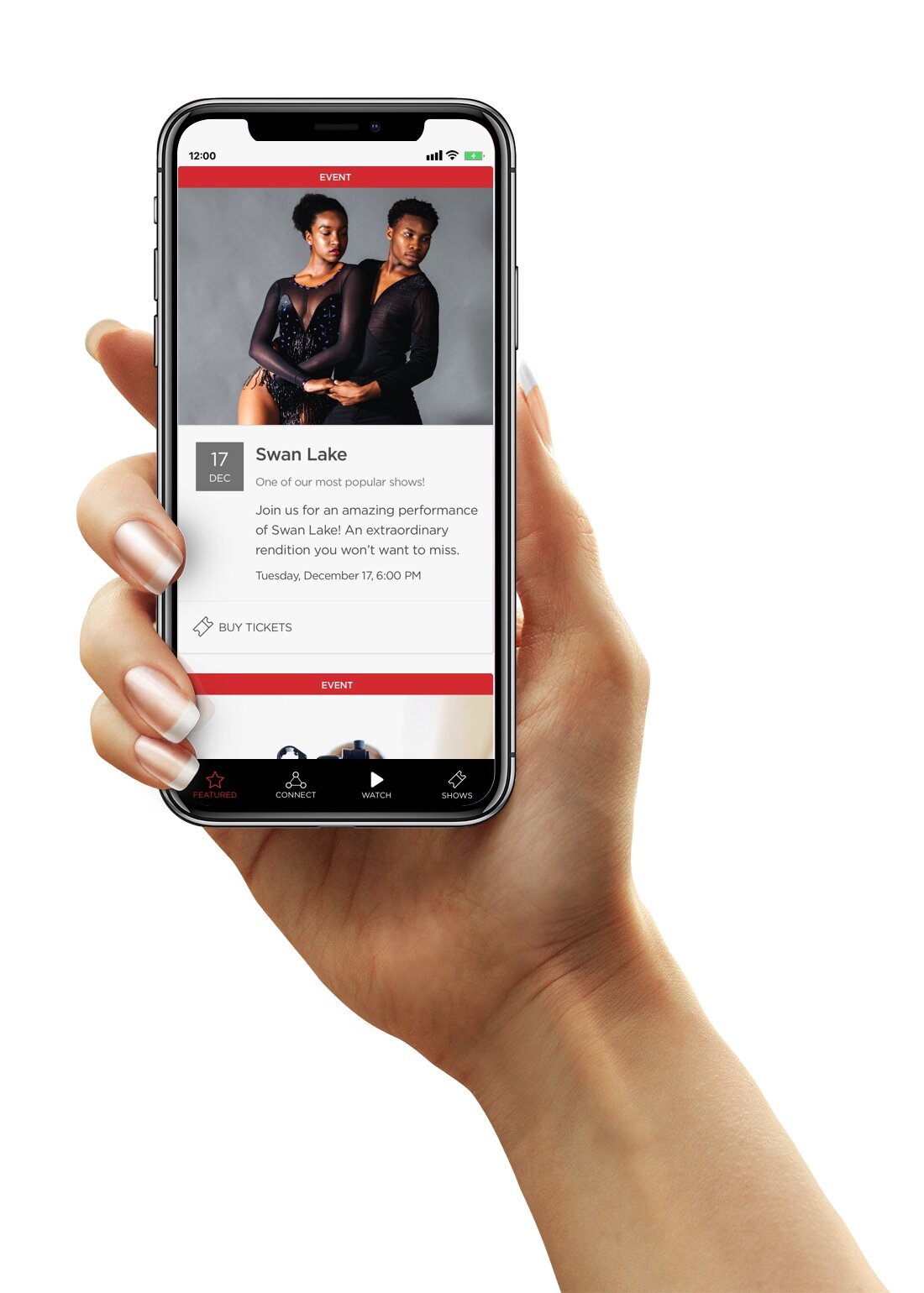
Featured | An event card type
Featured | A news card type
Watch | Users can choose to watch past performances
Featured | A media card type
Connect | A button makes it easy to donate
Watch | After tapping ‘Opera Santa Barbara’
Watch | After selecting performance of choice, users are directed to an in app video experience
High Fidelity Designs
Featured | Event card type: An example of an upcoming performance
Featured | Media card type: Users can watch access performance videos from the homepage
Connect | In the higher fidelity design I brought in rich imagery and Granada’s branding colors
Watch | Users can filter their results based on ‘latest’ or ‘popular’ performances
Featured | Event card type: Used here to encourage foot traffic at workshops
Featured | News card type: Used to promote a letter from the theatre director in this instance
Watch | Users can watch all past performances or choose based on performance type
Watch | Users can watch their chosen performance within the app experience
Final Prototype

Solving the Problem
Problems
Users did not have a consistent way of staying in touch with what was going on at Granada Theatre.
Granada Theatre had an exposure problem; users were not aware of everything that they offered.
Users expressed frustration with onboarding and outdated content.
Heuristic evaluation uncovered apparent navigational inconsistencies
Solutions
The featured page replaced the static homepage of the current app. The featured page was designed to be a feed, surfacing upcoming events, news, and previously recorded performances. Users that were finding out about events at Granada Theatre passively are now empowered to stay engaged.
The featured page could be used to bring attention to events that have less foot traffic, such as workshops (67% of research participants were unaware that Granada Theatre offered more than performances).
A ‘Watch’ page was added to the app experience. This feature adds value to the app, incentivizing users to keep coming back, thus keeping Granada Theatre in their mind.
The tab bar replaced the inconsistencies in navigation. Now, the user is less likely to get disoriented. The tab bar is a constant and consistent navigational element of the app design. Titles are now at the top of each app page, reminding users where they are in the app experience.
The old static homescreen of the current app
The new ‘featured’ screen replaced the static experience in my redesign
Retrospective
Given the fact that this was a 72 hour personal exercise, there were some major limitations. I highlighted some below.
Low number of research participants: I did not have a robust user group to research, and while the research did inform my design direction, a higher volume of subjects would result in a more comprehensive understanding of the problem.
No contact with Granada Theatre: It must be called out that I had no contact with Granada Theatre. Getting to know things about the theatre that are working well, areas that they would like to see improved, and dreams for the future would have informed my design direction.
No mobile app analytics: Having some analytics about the current app would have been instrumental in my design. Data such as number of downloads, insight into how users found the app, number of unique sessions per day and number of active users would help me to make tactical decisions during the redesign process.